
Ever wonder why some flights are always full while others fly nearly empty? Airlines use network analysis to see how airports connect and which routes are the busiest. This post explains how tools like PageRank centrality (a way to spot the most connected airports) and average shortest path length (the quickest routes between airports) help airlines fine-tune their schedules. Experts study real flight data to uncover trends that can cut travel times and reduce costs. Stick with us to see how these smart insights make air travel more efficient for everyone.
Airline Network Analysis Fundamentals: Key Metrics for Connectivity and Efficiency
Metrics in airline network analysis give us a clear look at how well a network is running and where it could do better. They measure how connected and efficient the network is so that analysts can see which routes are boosting performance and which hubs are driving most of the passenger traffic. This information is key when planning route changes that can cut down travel time and lower operating costs.
The analysis treats each airport as a node and every flight as an edge connecting them. In these directed graphs, the flight path matters, which makes it easier to spot patterns like which airports get more arriving flights versus those that mainly send out departures. This setup lets analysts calculate useful measures like PageRank centrality. When an airport scores high on PageRank, it means the airport is well-connected, much like a busy hub that steers many routes.
Key metrics include:
- Average shortest path length
- PageRank centrality
- Degree centrality
- Betweenness centrality
- Edge density
- Clustering coefficient
- Passenger traffic flow
Each metric plays its part in painting a full picture of the network. Average shortest path length and edge density reveal how overall connected the network is, while measures like PageRank, degree, and betweenness highlight the most important hubs. Clustering coefficients show how groups of airports link together, and tracking passenger flow brings a real-world performance check into the mix. Together, these metrics guide decisions that can improve route efficiency and boost connectivity for everyone traveling.
Data Sources and Analytical Tools for Airline Network Analysis

Many open-source and public data sets form the backbone of today’s airline network analysis. For example, the Netzschleuder’s eu_airlines dataset shows a complex network with 37 different types of airline routes, which helps explain European travel patterns. The US Department of Transportation adds another important resource with 25 years of flight and passenger data. Analysts use these rich datasets to spot trends and track how connectivity changes over time. Fun fact: a single dataset can reveal how European air routes have evolved from countless flight records.
Key software tools turn raw numbers into clear insights. Python’s NetworkX helps measure network details with precise calculations, while Gephi makes it easy to explore and visualize busy route maps. The R language, using its igraph package (a tool for network analysis), offers simple commands for statistical checks. And for those who need live data, commercial platforms like OAG FlightView deliver real-time tracking. These tools let analysts simulate different scenarios and check how well routes are performing.
Reliable findings depend on reproducible workflows. Analysts often use interactive notebooks together with version control to record each step. By mixing open-source scripts with collaborative platforms, teams create transparent records that can be updated as travel trends change. This approach helps keep airline network analysis strong and ready for future challenges.
Visualization Techniques in Airline Network Analysis
Map-based Visualizations
Mapping methods put airports and their flight paths on real maps using geospatial basemaps (maps that show real-world geography). They use arrows or lines in different colors to show how busy a route is. Even places like Guam and the US Virgin Islands are shown as if they are part of the same group, so nothing gets left out. Picture a bright line stretching from one coast to the other, with each hue telling a story of passenger numbers. These maps help you quickly see which flight routes are the busiest and can be a handy tool to judge route efficiency.
Graph-based Visualizations
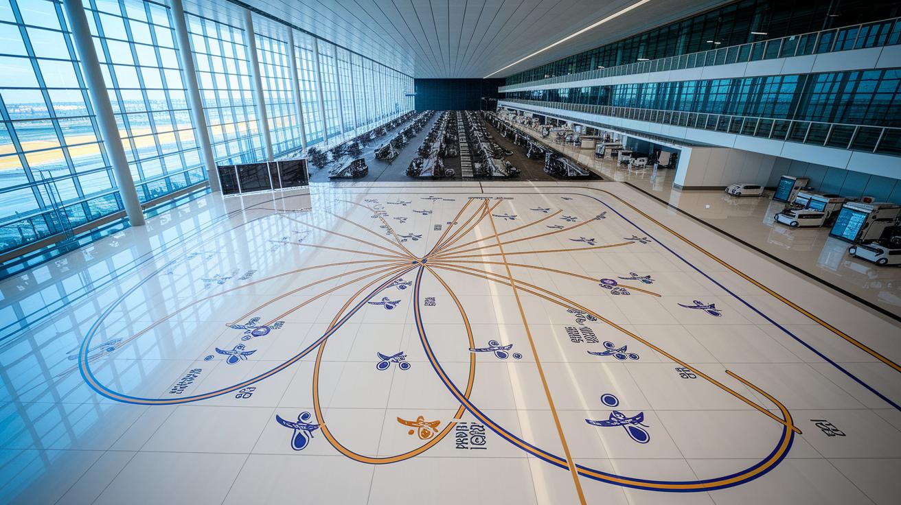
Graph techniques use layouts like force-directed and radial hub-spoke diagrams to show how connected different airports are. In a force-directed diagram, nodes (the airport dots) pull towards or push away from each other based on their importance, almost like magnets. Radial diagrams put the main airport in the center and arrange less busy ones around it. This setup makes it easy to spot the key hubs in the network. Plus, analysts can use interactive dashboards to filter by carrier or date, so they always have the latest route performance data.
| Visualization Type | Key Tool | Typical Use |
|---|---|---|
| Geospatial Map | GIS Software | Plotting airport nodes and traffic corridors |
| Force-Directed Graph | NetworkX/Gephi | Evaluating node centrality and interactions |
| Radial Hub Diagram | Custom visualizations | Highlighting core hubs and spokes |
Airline Network Analysis: Efficient Route Insights
Airline networks use shortest-path optimization to trim travel times. Analysts rely on methods like Dijkstra’s and A* (techniques that pick the fastest route) to find the best paths between airports. Tests show that adding feeder links, extra connections to smaller airports, can lower delays. Even a small connection might cut off precious minutes from a busy route.
Hub-location models offer a clear plan to reshape a network. Using linear programming (a math method for finding optimal answers), these models choose the best spots for hubs so that flights connect smoothly. This strategy helps reduce long layovers and sets steady flight frequencies. In short, smart hub placement helps airlines balance demand and keep operations running on schedule.
Genetic algorithms bring a flexible way to spread out network capacity. By mimicking natural selection (trying many ideas and keeping the best), they test different load setups until a balanced plan emerges. This process makes sure no single part of the network gets overloaded while maintaining solid service everywhere.
Dynamic rerouting tackles unexpected problems like delays or bad weather. These systems adjust routes almost in real time by using fresh data. They quickly change flight paths to keep the network running smoothly and minimize hassle for travelers when conditions suddenly shift.
Case Studies of Airline Network Analysis in Practice
A 25‑year study in the US looked at domestic air travel from 1990 to 2015. Researchers compared flight data to see which routes grew and which ones faded over time. They tracked trends that showed how shifting demand affected the network. For example, coastal routes saw a huge jump in passengers, highlighting the need to rethink slot allocation and manage capacity better during busy times.
In Europe, analysts used a dataset called eu_airlines to build a network model with 37 different route types. They applied methods like PageRank (a way to measure importance) and betweenness centrality (a way to see how key an airport is in connecting others) to rank major hubs. These rankings showed that some airports are not just busy; they also play a key role in keeping the network running smoothly during peak hours.
Another study compared a multi‑hub carrier model to the traditional hub‑and‑spoke system. It showed that a well‑balanced multi‑hub setup can cut congestion and offer more alternate routes for travelers. Carriers using this model experienced shorter average travel times and better use of capacity. In short, spreading out the network helps make air travel more efficient and gives passengers more options.
Strategies and Best Practices for Strategic Network Planning

Airline network planning uses clear, fact-based steps to match routes with actual demand. Airlines calculate centrality scores (numbers that show a route’s importance) to spot which paths need strengthening. This way, they add routes where passengers really want to travel.
Scenario modeling, which means running what-if plans, helps balance the available seats with the real flow of travelers. Interactive dashboards provide real-time updates on on-time departures and flight reliability, so teams can quickly address any issues. Stress tests simulate different disruptions to make sure the network stays strong even when things go wrong. Overall, these methods not only boost how full flights are but also create a more robust network. By regularly checking schedule performance and running optimization tests, airlines can adjust services fast during changes and busy times.
Strategic Network Planning Framework
- Data gathering and metric selection
- Analytical modeling and visualization
- Scenario testing and optimization
- Implementation and continuous performance monitoring
Final Words
In the action, we broke down how core metrics and graph models shape airline network analysis.
We reviewed data sources, analytical tools, and clear visualization methods that uncover route patterns.
The discussion on optimization algorithms and real case studies offered a fresh look at connectivity trends and strategic planning steps.
These insights on airline network analysis guide smart, practical decisions for managing travel with ease.
Moving forward, each insight helps pave the way for smoother, better travel experiences.
FAQ
What does an airline network analysis PDF include?
The airline network analysis PDF explains key metrics like PageRank, betweenness centrality, and degree centrality. It details how these measures assess airport connectivity and route efficiency, offering a clear guide for industry studies.
How does an airline network analysis example illustrate key concepts?
The airline network analysis example uses real data to show how graph-based metrics and connectivity studies reveal hub importance and route efficiency. It provides a practical snapshot of analysis techniques for evaluating airline networks.