

Ever stared at a flight map and wondered if it’s a puzzle or a hidden guide to easier travel?
At first, the crisscrossing lines might seem confusing. This guide shows you what each symbol means in plain language so you can spot big hubs, regular flights, and special stops.
It turns a messy web of routes into a simple tool to plan your next trip. Stick with us and learn how a route map can make your flight planning clear and stress-free.
Interpreting Airline Route Maps for Travel Planning
Airline route maps are a handy tool for planning your trips. They keep things simple by not showing extra details like mountains or rivers. Instead, they focus on how cities connect. You might notice that distant places are shifted around to highlight links between them. The map legend uses clear symbols and colors, so you can quickly see major hubs and the routes that connect them. For example, a thicker line usually means there are many flights, while a thinner line shows less frequent or seasonal service.
The legend is your best friend here. Colors often stand for different airlines or services, and line styles tell you if a flight is direct or arranged through a codeshare (a shared flight by more than one airline). Icons mark hubs, airports, and even the type of stops along a route. Hubs work as central points where many flights meet, and smaller routes branch out from these centers. Taking note of these clues makes it clear which routes will work best for your travel plans.
Have you ever heard a surprising fact? Before it became famous for its global network, one airline used a symbol that looked like a star to mark its only international gateway. This symbol hinted at its future growth.
Here’s what the symbols mean:
- Circle: Marks a major hub or central airport where many routes meet.
- Square: Shows a regional airport with a fair number of connections.
- Solid Line: Indicates a direct flight that runs often and is reliable.
- Dashed Line: Points out an indirect route or one that runs only sometimes and might include stopovers.
- Arrow: Tells you the flight direction, so you know which way you’re heading.
- Star: Highlights special stops, like international gateways or unique service points.
Keep these basics in mind when you look at an airline route map. They turn a complex web of flights into a clear guide that can help you plan your next adventure with ease.
Key Features of Airline Route Map Design and Principles
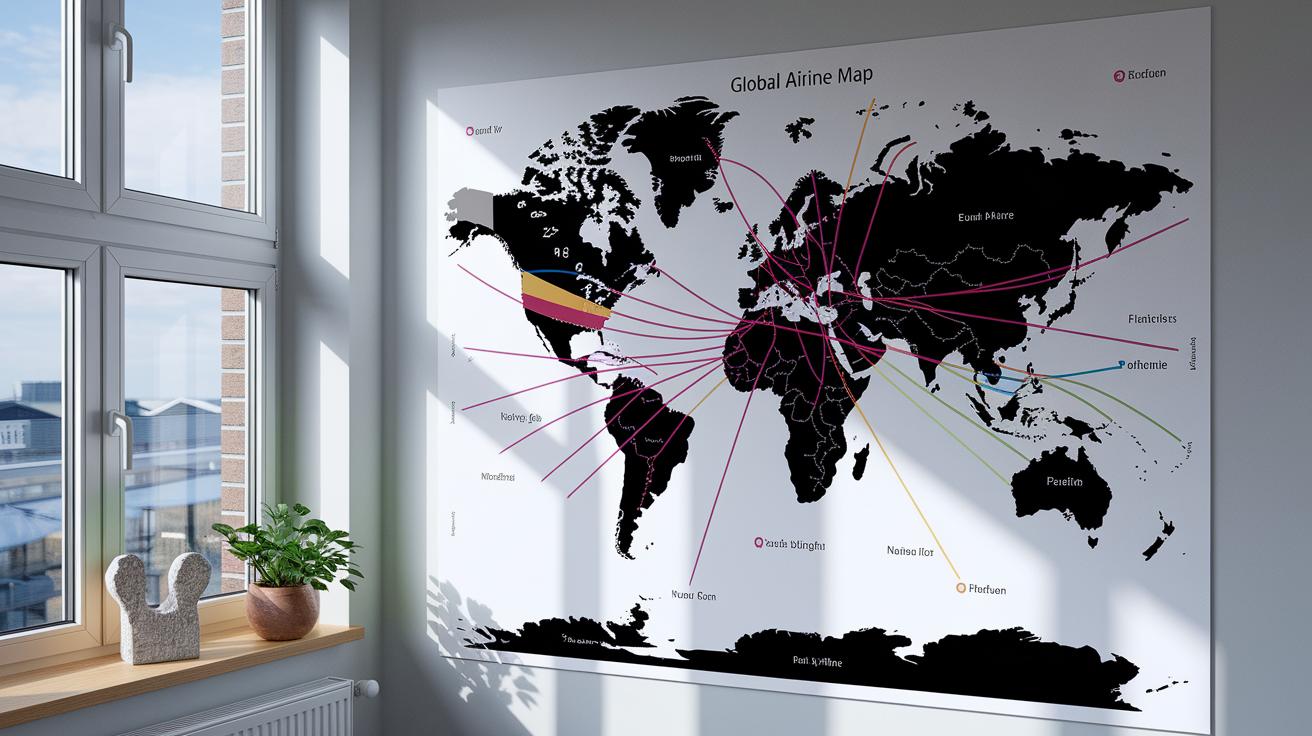
Airline route maps have come a long way. They started with a simple hub-and-spoke style that focused on key Western centers. Today, maps use a global point-to-point design that fits our connected world. Early map designers marked major transit hubs. Later, they expanded their view to show growing regions and changing network strategies. A good example is a 1960s map that moved from a single hub focus to showing many connecting routes.
The way maps use color and line weight has also improved. Back then, different airlines were shown with just one color each. Now, maps mix bold and thin lines to show how often flights run and what kind of service they offer. A thick, bright line might mean there are daily flights, while a thin line could point to less frequent service. This method gives a clearer picture of how busy each route is.
Modern maps also simplify how they show geography. They leave out many natural details to focus on important markets and city links. Instead of drawing every river or mountain, designers highlight direct connections between cities. This makes it easier for travelers to understand the network and plan their journeys.
Comparing Static, Interactive, and Animated Airline Route Maps
Static maps show fixed flight routes on a simple background. They work great for printed materials and digital PDFs. These maps are made as vector graphics (smoothly scalable images) and use bold colors to mark hub connections and indicate flight frequency. With options to match a company’s look, they turn complex routes into a clear, easy-to-read image.
Interactive maps let you explore details easily. You can click or hover over different areas to see more about flight paths. They even let travelers plot routes, including stops or multiple legs. This map style often includes filters by carrier or flight frequency. For example, Mapcreator has a multilingual interface in English, German, French, and Spanish, making it simple for travelers around the world.
Animated maps bring route details to life with movement. They use moving icons to show a flight’s progress or seasonal schedule changes. Animated maps work best in digital settings like online media or presentations. They are fun and engaging, especially when you need to explain how routes change over time.
| Map Type | Interactivity Level | Primary Use |
|---|---|---|
| Static | None | Printed/digital publications |
| Interactive | High | Trip planning and real-time exploration |
| Animated | Moderate | Dynamic storytelling and digital media |
Tools and Software for Visualizing Airline Route Maps

Mapcreator stands out with a plan that lets you export unlimited SVG and PDF files for €99 per month. It offers a multilingual interface in English, German, French, and Spanish and has simple styling controls to match your look. The tool is built for trips with many stops and produces clear, high-resolution images for both online and printed work.
RouteDesigner is another great option that brings strong interactive features. Its design is easy to use, which helps you create detailed maps quickly. Starting at €85 per month, it allows real-time changes and custom export options that keep even complex routes easy to read.
AirMap Visualizer focuses on visual appeal and ease of use. It uses clear symbols and neat graphics to show major hubs and smaller stops. For €75 a month, this tool offers high-quality exports and flexible design settings so you can easily adjust maps for different uses.
FlightPath Studio is ideal for long itineraries with many stopovers. Its adaptable interface lets you change routes on the fly. You can export detailed maps in SVG and PDF formats. Priced at about €95 per month, it is meant for professionals who need accurate and precise visualizations.
NavigatorX wraps up the list with a simple system for planning complicated journeys. It offers several customizable styling options that work well with various brand guidelines. At a competitive €80 per month, NavigatorX is easy to use and delivers powerful export features for both digital and print projects.
Planning Your Travel Using Airline Route Maps Effectively
Airline route maps are handy tools for planning any trip. Start with an interactive map like the one from the Low Cost Airline Guide. Pick your start and end points on the map to get a clear picture of your journey and find budget-friendly options.
Next, sketch your preferred route. Check the map legend for details on line styles and symbols. Bold lines usually show busy hubs with frequent flights, while lighter lines mean less regular or seasonal service. These clues help you spot the best connections.
Then, take a look at different airlines along your route. The map uses color codes to separate direct flights from codeshare options (flights operated by partner airlines). This lets you quickly see which airline fits your schedule best.
After that, focus on layovers and connectivity. Notice where hubs cluster on the map; these spots often offer efficient stopovers. Symbols in the legend mark key stops and seasonal routes, so you can choose routes that save time and cut costs.
Finally, refine your schedule by checking for extra stops or symbols that might indicate delays. This extra step helps you avoid long layovers and keeps your travel smoother. With a clear view of timing and hub density, you can plan an itinerary that balances convenience and affordability.
Customizing Airline Route Maps for Marketing and Branding

Airline route maps have been used for years to add a touch of glamour to air travel. In the early days, designers would tweak maps, often placing Hawaii closer to California, to make travel seem more appealing. Today, airlines turn to custom color schemes, icons, and special line designs that match their brand. These elements help highlight key markets and create a look that passengers can quickly identify. For example, one well-known airline uses bold reds and blues for its major hubs, drawing thicker lines on the most popular routes and thinner lines on seasonal or codeshare routes. This not only makes the maps eye-catching but also helps travelers spot reliable routes at a glance.
Brands now draw inspiration from digital design trends to upgrade their maps. A recent project saw a boutique airline work with a creative studio to design custom icons that fit its modern image. This approach transforms a functional map into a powerful branding tool, reinforcing the airline’s presence in the market and making its service more inviting.
Best Practices for Accurate Airline Route Mapping
Mapping airline routes accurately relies on using up-to-date and reliable data. If you use only artistic, marketing-style maps, you might end up with wrong distances or routes. Experts suggest that map makers double-check their work with official flight schedules, GIS (a system that shows maps and location data), and current airline information. For example, if a map leaves out mountain ranges or borders, travelers might get the wrong idea of how far they need to go. Always checking your data sources carefully can help avoid these mistakes.
You also need to update maps regularly to keep them accurate. Airlines change their flight schedules with the seasons and for other reasons, so old maps can mislead people. A good route map is built through a process that refreshes details with official airline reports and real-time data. This keeps the map a useful tool for planning flights and understanding how airlines connect cities.
When creating airline maps, it is important not to oversimplify. Simple visuals can be clear, but they must still show key features like major geographic barriers. Checking several sets of data and using the right scale helps make sure natural obstacles and regional details appear correctly. This care in mapping not only leads to safe and efficient travel plans but also builds trust among passengers who need dependable route information.
Airline Route Map FAQ: Common Questions Answered

All the essential details have been built right into the main article, so you have everything you need in one place.
Final Words
In the action, this post broke down how to read airline route maps by explaining legends, symbols, and design basics. We compared static, interactive, and animated maps and checked out top tools to simplify travel planning.
These insights pave the way for smarter itinerary choices using our airline route map guide. Enjoy clearer planning and smoother trips ahead.
FAQ
Q: What options exist for airline route maps, including live guides and PDF versions?
A: The airline route map guide offers both live interactive displays and downloadable PDF formats. These maps show flight connections, hubs, and frequency so you can plan your travel quickly.
Q: What is the website to see all flight routes?
A: The website for viewing all flight routes aggregates real-time mapping data into one portal. It enables you to see direct connections and codeshare flights, making itinerary planning easier.
Q: How do I tell if my house is in a flight path?
A: Determining if your home is in a flight path involves checking official airport boundary maps or local government resources. These maps highlight areas under regular aircraft routes.
Q: What is the best flight path finder?
A: The best flight path finder employs live mapping tools that showcase routes, stopovers, and flight frequency. This tool makes it easier to compare options and plan efficient travel itineraries.
Q: Which airline should I stay away from?
A: Deciding which airline to avoid depends on individual travel needs. Reviewing recent safety scores, on‑time performance, and customer feedback can help you select a carrier that meets your standards.